Case Study
HBJ Property Management
HBJ Property management is a real estate start-up by Harry B. Joseph, who purchases properties and renovates them for potential clients.

01.
Planning & Sketching
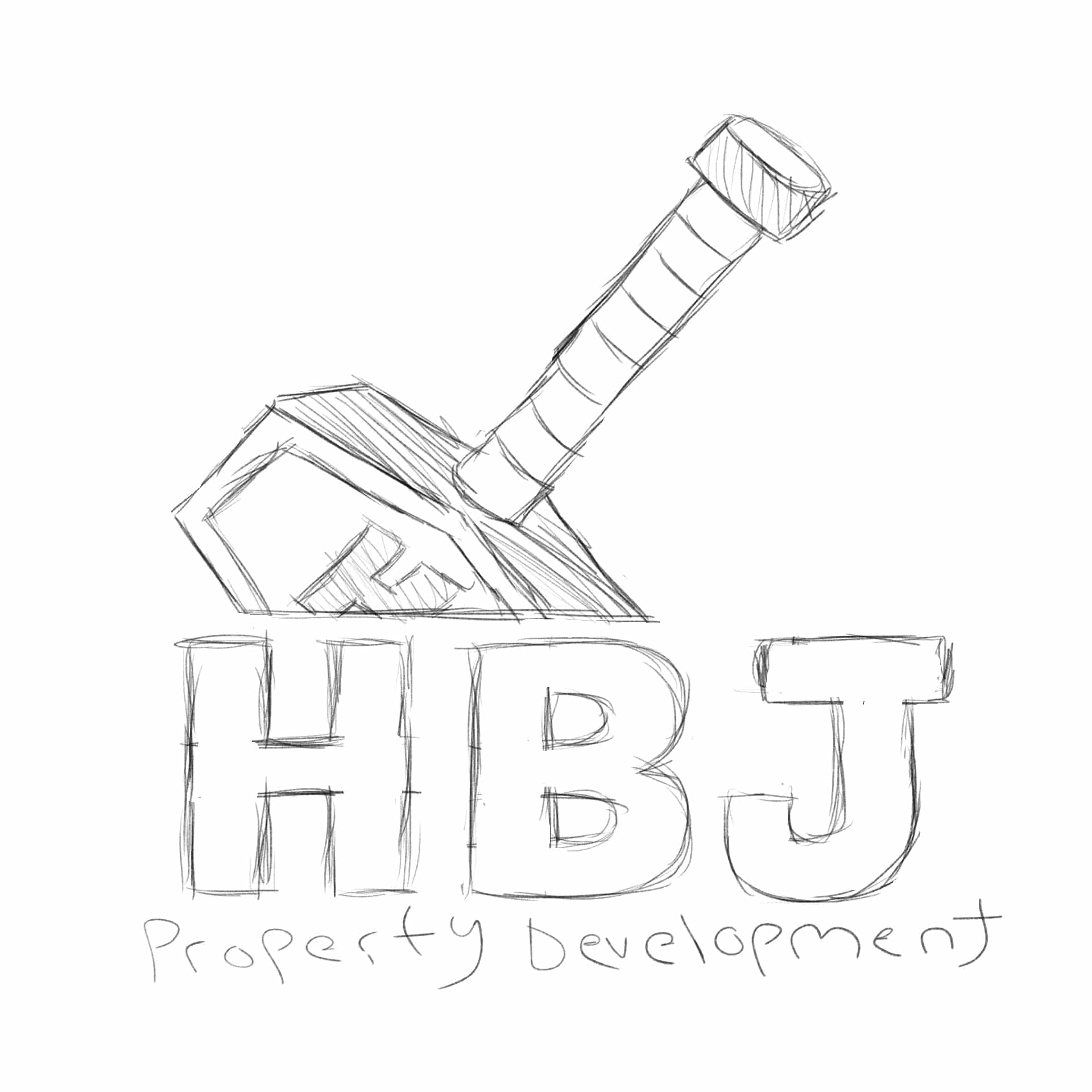
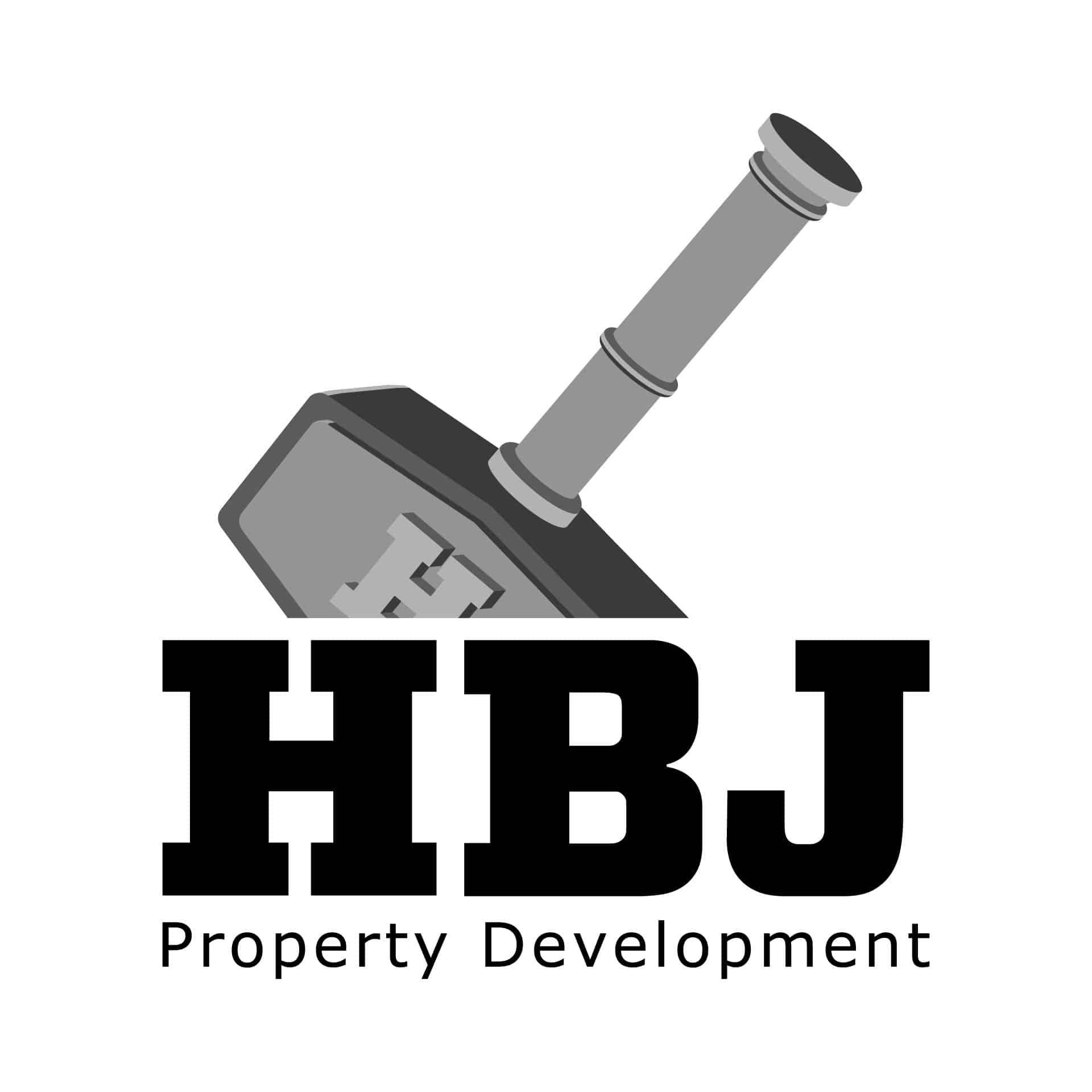
For the planning process of the HBJ logo, there were a few ideas that client wanted to explore. Starting off, he was interested in adding a hammer design, similar to Thor’s hammer from the Marvel comics. After creating the initial sketch and implementing a polished version, the client decided to move away from the hammer idea. The client also wanted to change the subheading of the logo from “Property Development” to “Property Management”.
02.
Digital Refinement
After moving away from the initial concept, the client wanted to explore a design based on eastern architecture. What we ended up going with was a logo design that involved a Torii, a gateway seen in many Japanese shrines. In order to compliment the torii gate, we added a rising sun with sunlight shining through.


Crimson Red
#a21d21
Dark Gray
#5c5c5c
03.
Selecting The Colors For The Brand
Lorem ipsum dolor sit amet, consectetur adipiscing elit. Maecenas porta urna eget massa auctor, vitae maximus nulla tempus.
Results
Final Result


Testmonial
Portfolio
Related Work

Pregnancy Care Illustrations

Pregnancy Care Illustrations
Get In Touch
Let’s Work Together!
hello@bryantalmonte.design
Phone
(561) 201 – 2490
Address
22232 SW 61st Ave
Boca Raton, FL 33428
